Half-Hourly Energy Reports
A feature I designed at SSE to help business customers access their half-hourly energy data without having to email support and wait for it.
Note: Much of this work is confidential, so what's shown here is a close recreation - colours, icons and branding changed, structure and content kept true to the original.
Company
SSE (Scottish and Southern Energy)
Type
Dashboard Design & Data UX
Role
Lead Designer (end-to-end)
Team
Timeline
~12 weeks, alongside other work

Process
The problem
SSE was getting a flow of support emails from business customers who couldn't find or download their half-hourly energy data. There was no way to self-serve it; customers had to email support and wait, sometimes days, for someone to manually pull a spreadsheet and send it over.
For facilities managers and sustainability officers, this data isn't a nice-to-have - it's what they use to spot consumption spikes, benchmark usage, and report to their own stakeholders. Not being able to get it reliably was slowing down their actual jobs.
What customers wanted
I interviewed 10 business customers- facilities managers, sustainability officers, finance teams- to understand how they'd use this data if they could get it easily.
I expected visualisation to matter most: charts, trends, a dashboard people would come back to. It did matter, but not as much as I assumed. What surprised me was how much more people cared about getting clean data out than viewing it in our tool. Several told me they'd just re-import our numbers into their own spreadsheets or reporting systems regardless of what we built, so if export was clunky, nothing else about the tool mattered to them.
That reset the project's priorities. Export needed to be the primary path, not a secondary button under a chart.

Process
User flow
Working with our PM and two data engineers, I mapped the user flow from "I need this data" to actually having it. My part of this was the customer-facing decisions - what date ranges to expose, what format options to offer, where people were likely to get stuck. The engineers scoped what was technically possible on the backend; the PM decided what shipped in v1 versus later.
One thing I pushed for early: a single screen rather than a multi-step wizard. Customers doing this task are usually already mid-task themselves - pulling data for a report that's due - so every extra click was a chance for them to give up and email support anyway, which was the exact behaviour we were trying to remove.

Process
Testing and what changed
We tested the wireframes with real customers before touching visual design, while it was still cheap to change things. The structure held up well. Two things didn't:
Too many format choices caused hesitation. The first version offered CSV, XLSX, JSON, and PDF up front. In testing, people paused on this screen - a couple asked out loud which one they were supposed to pick. I cut it to CSV as the one-click default, with other formats moved behind a smaller "more formats" option for the minority who needed them. Nobody hesitated on that screen in the next round.
Bringing it to life
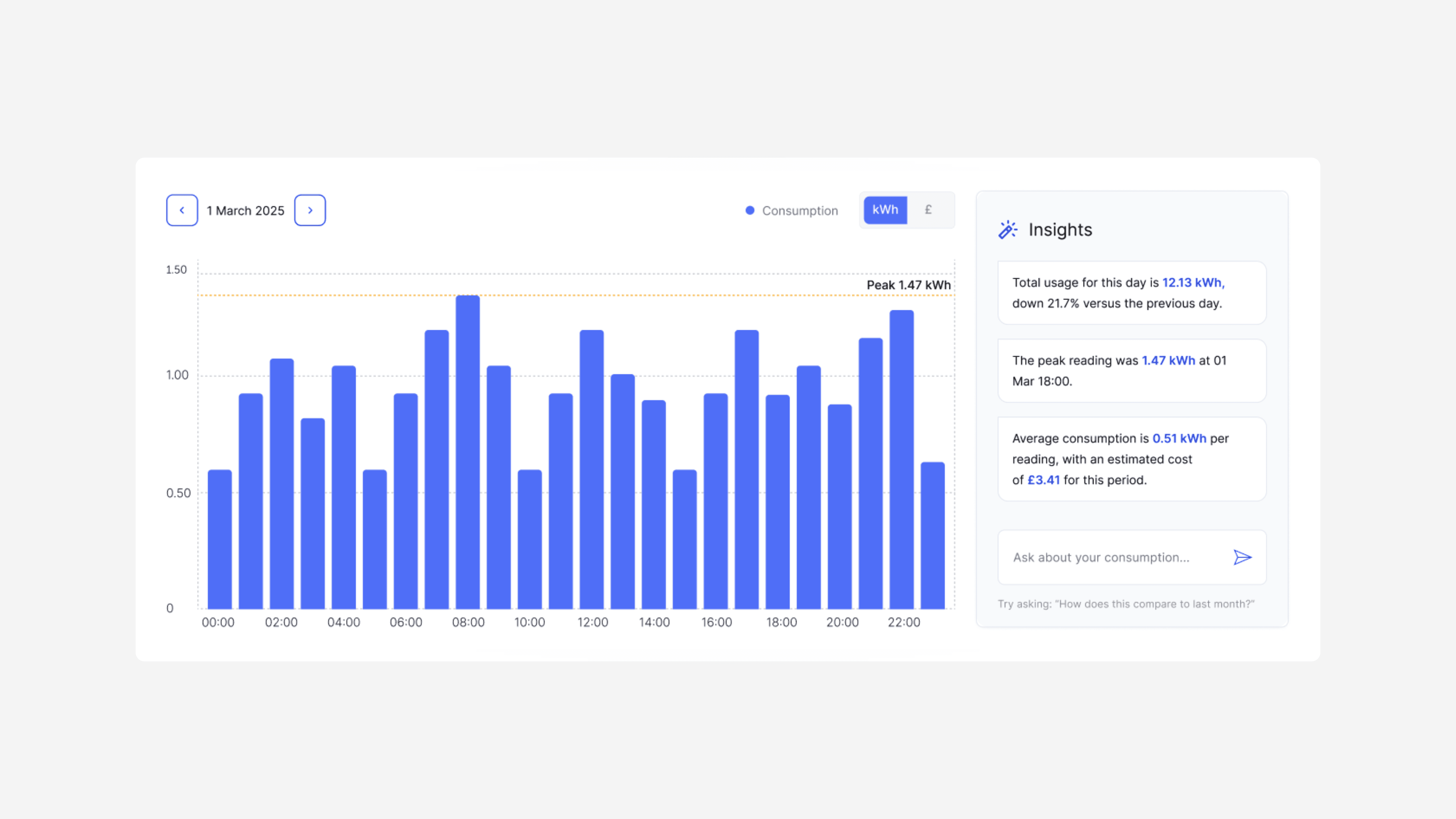
Once the structure held up, I moved into Figma for final UI. This was a new feature, not something customers already had a mental model for, so the priority was making it understandable without any onboarding - clean layout, brand-aligned, nothing that needed explaining.

Outcome
The feature now gets around 1,400 views and 124 downloads a month. Support queries about half-hourly data dropped from roughly 50 a month to under 10 - a problem that previously had no self-serve fix at all.
Since launch, we've started scoping a way for customers to ask questions of this data directly rather than only viewing or exporting it using our AI chatbot. This work is also done by me.
What I'd do differently
We initially built the solution in Power BI, which allowed us to get something up and running quickly, but it ultimately did not provide the best user experience. Looking back, I would have pushed the IT team to build the solution from scratch, with the user experience and user needs at the centre of the design from the outset. This would have given us greater flexibility to create a more intuitive, tailored and user-centred solution, rather than working within the limitations of the Power BI platform.